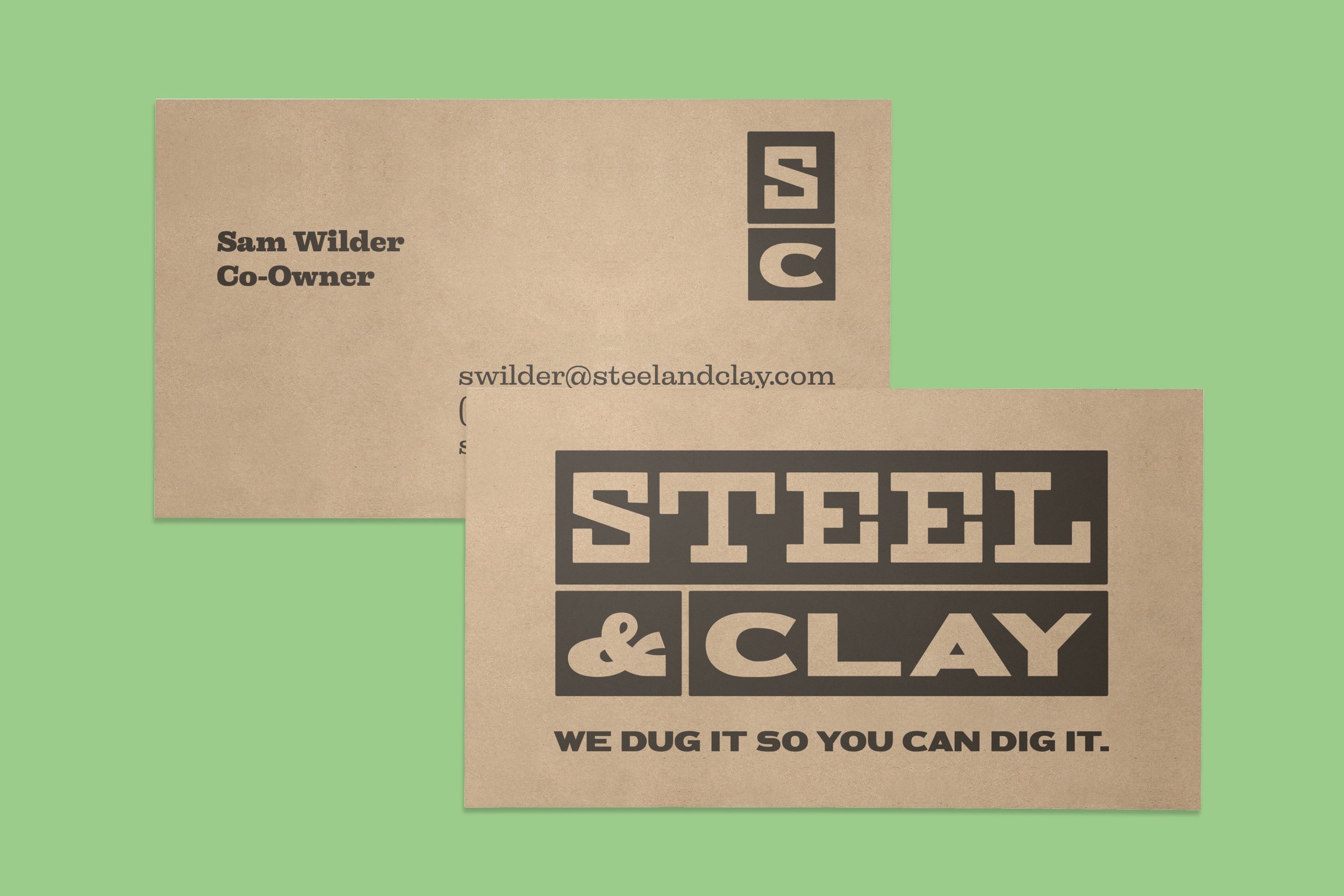
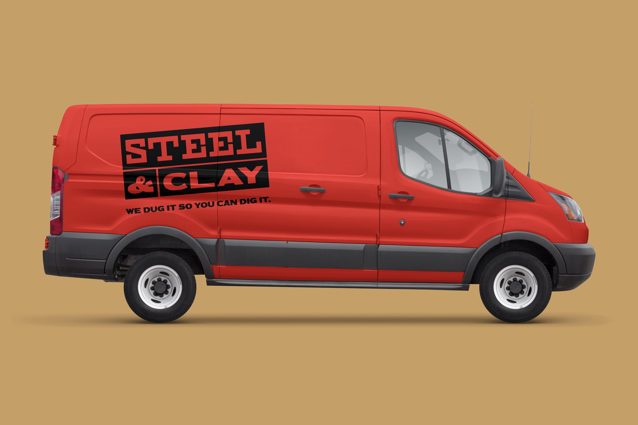
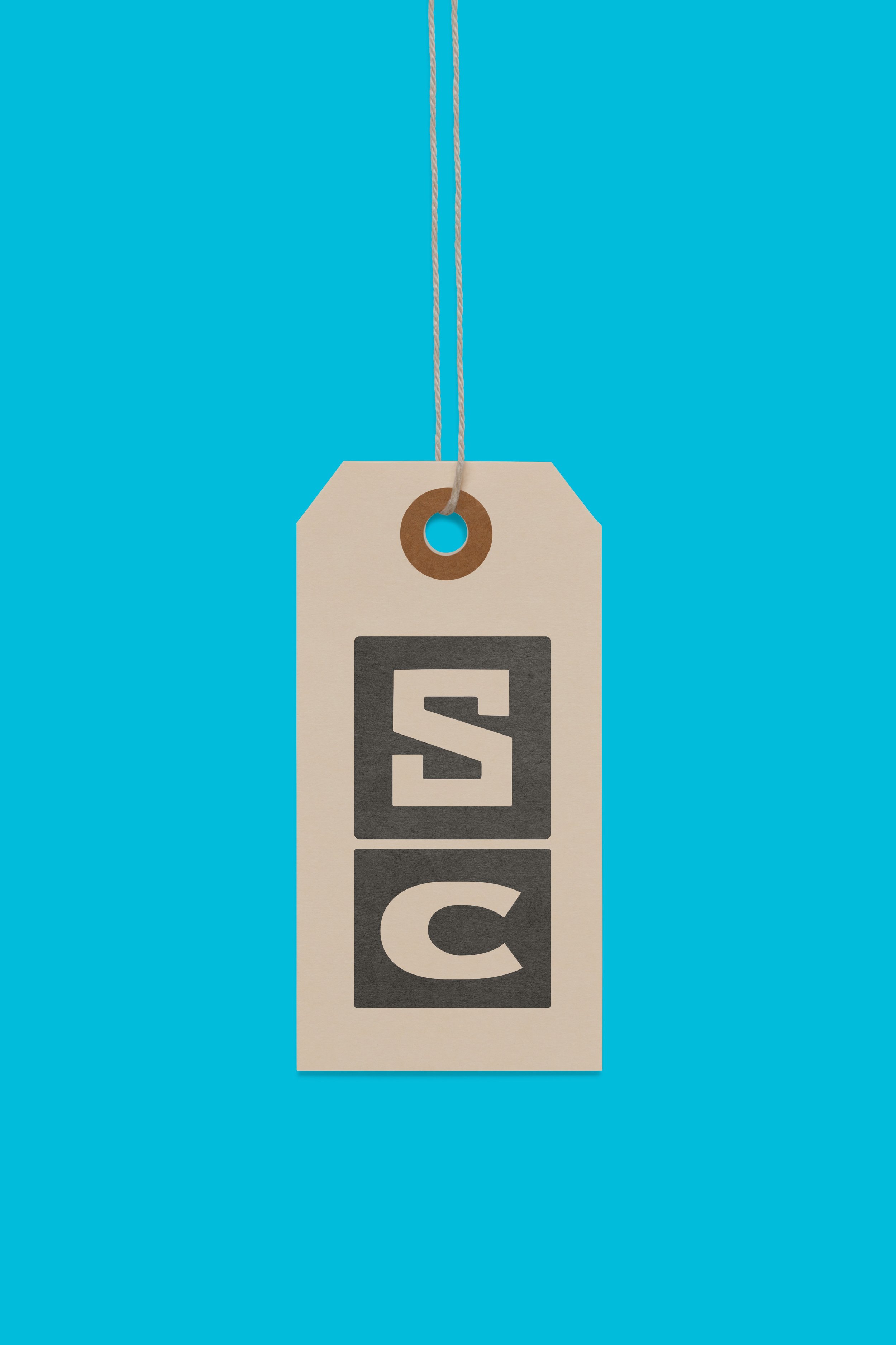
Steel & Clay Logo
Everybody needs a coach. They help you see your blind spots and encourage you when you need it most. Perhaps, they can also send you fun design work too? That’s the situation with my business coach, Sam Wilder. During one of our meetings, likely over Indian food, he shared about his new antiquing adventure, Steel & Clay, and asked me for a logo. I like Sam a lot, and I’m fascinated by old things. It was a no brainer.
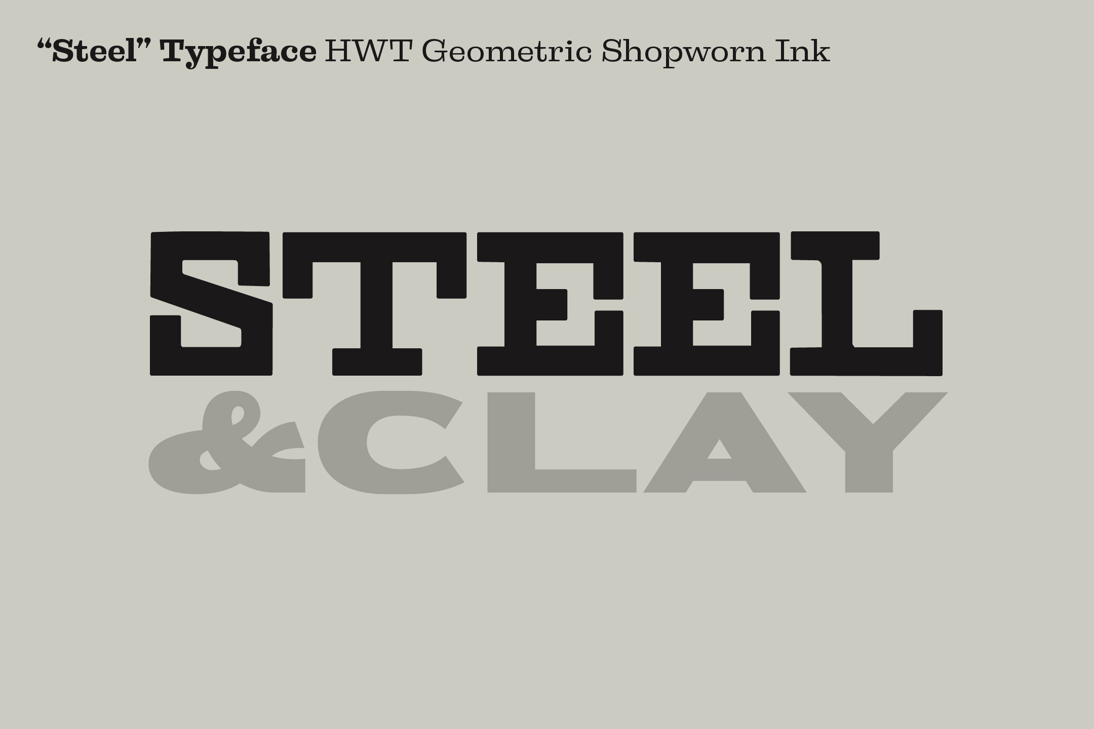
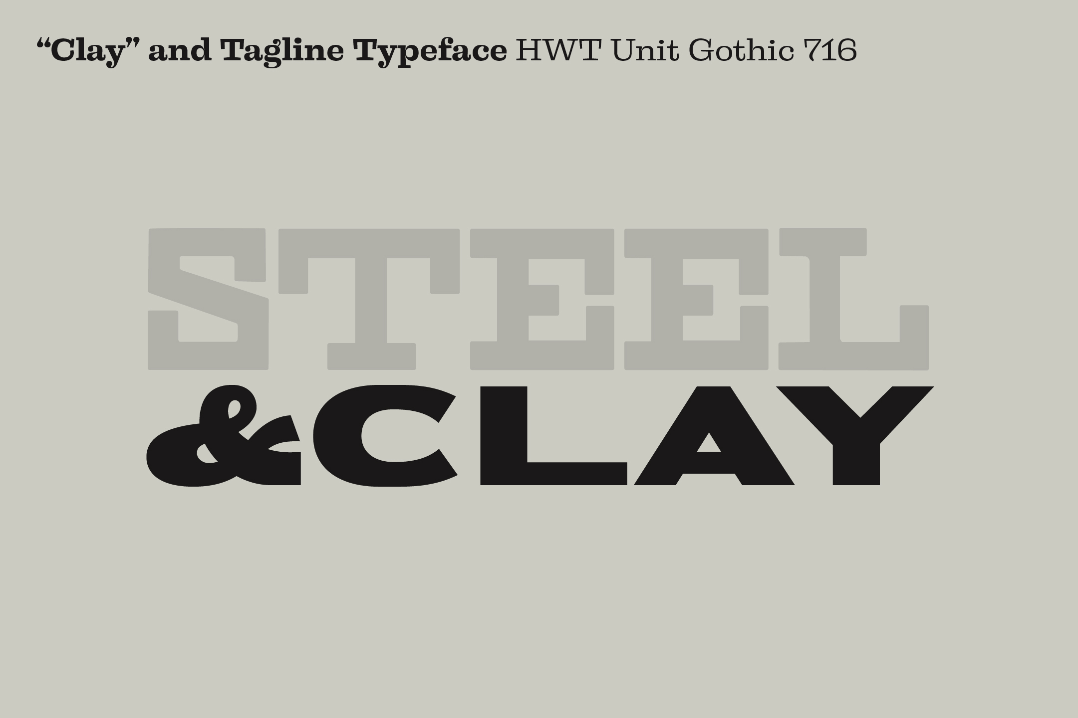
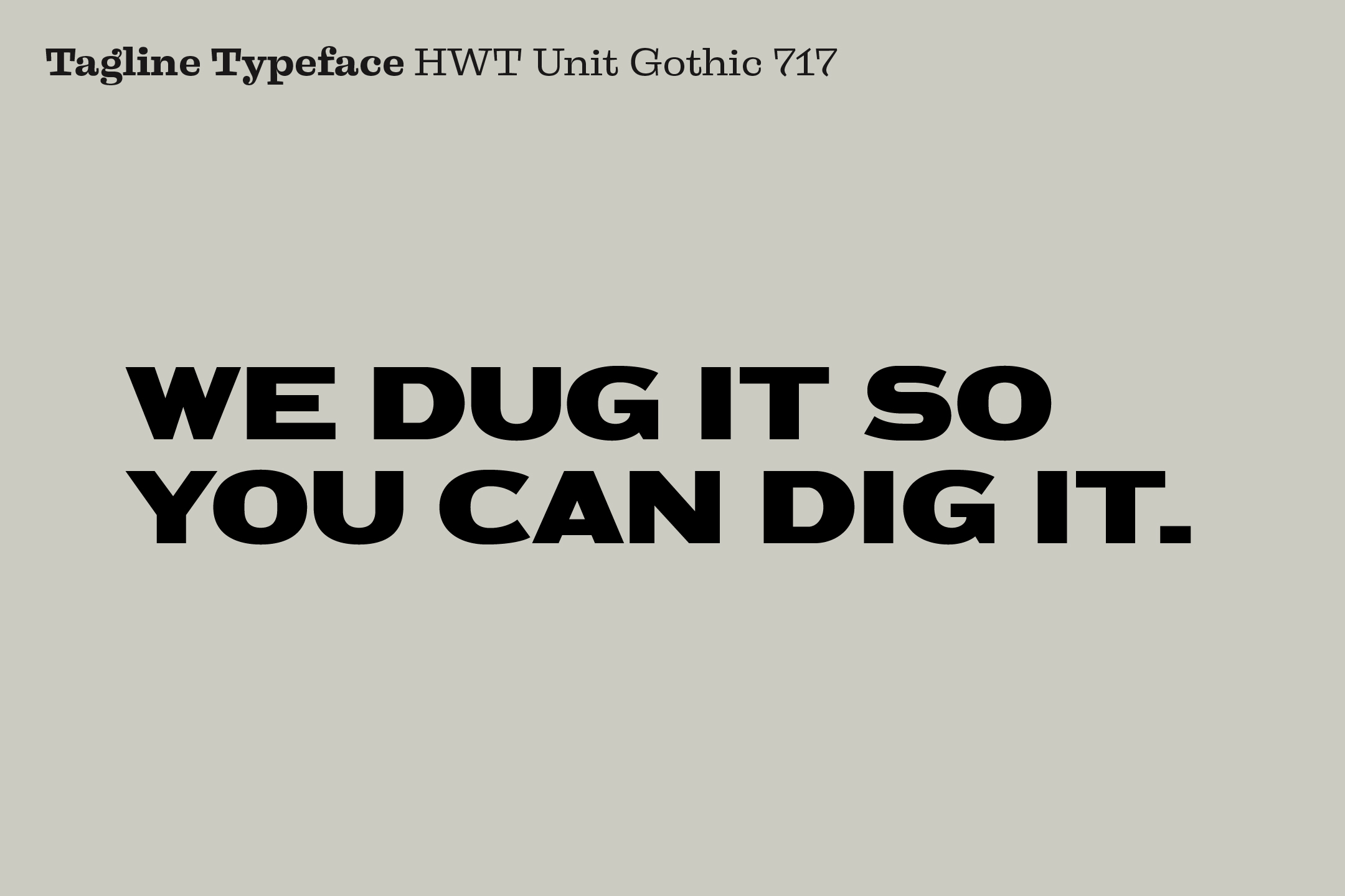
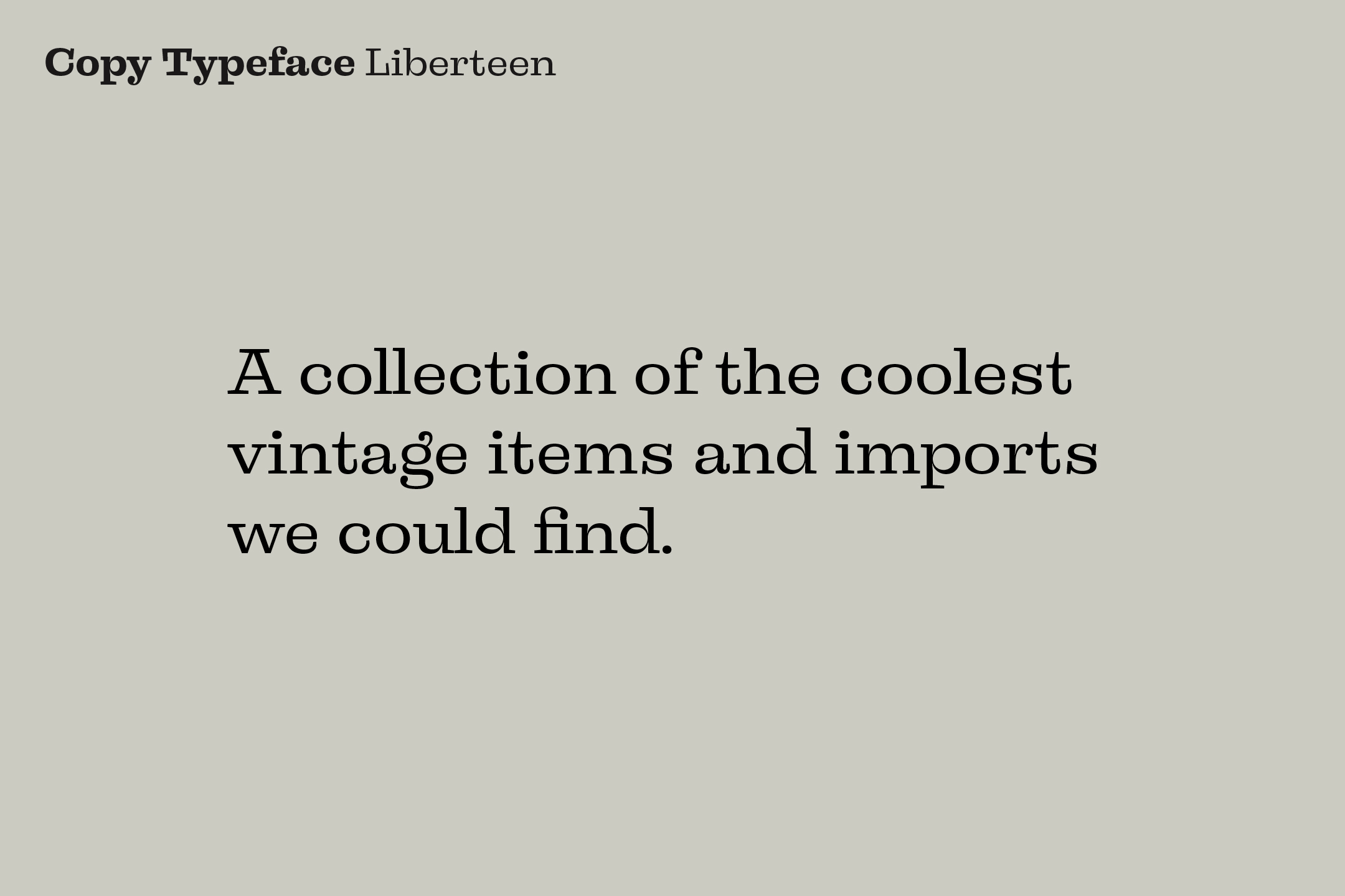
The logo and colors are inspired by the old signs and type among Steel & Clay’s inventory. The typefaces are from the Hamilton Wood Type project by P22 Type Foundry (found on Adobe Fonts). They felt appropriate because of their hand made roots that point to the past. The logo is stacked since “Steel” and “& Clay” are both comprised of five characters. It brings me much pleasure when words justify evenly. The type for steel references durability whereas Clay is less rigid, more organic. It's an unusual juxtaposition, but it has the right funk for the job.
To lean more about Steel & Clay visit their facebook page.
